
October 20, 2026
Nature is the ultimate broadcast, through which God speaks to all of us. Unfortunately, many of us are tuned to artificial terrestrial broadcasts.
Crrow777
Episode #702 covers the History of Broadcast Media.
Broadcast media has come to engulf nearly all forms of entertainment, information and advertising. At best it serves to homogenize our mental experience which would otherwise consist of unique experiences. At its worst it serves as a tool for social engineering, fear propagation, weaponizing information.
I will break-down two examples of mass-media that demonstrate intent. The first example from the “enter-tain-ment” (Broken down as: go in – and hold – mind) industry is a rock n roll album that has reached millions. The album was released on the spring equinox of 1979. The second example is a film production and distribution onscreen logo. We will examine images from the 1920s, up to September of 2001. Let’s begin with Supertramp’s 1979 album “Breakfast in America”, followed by Columbia Picture’s on-screen logo.
What I am about to point out is connected to 911. It is occult and plausibly deniable. September of 2001 brought into the light of day a reality-changing event that had been echoed in the media for generations. I have spotted encoded nods to this event well back into the black and white era of film. It shows up on analog clock faces, license plates, and addresses, among many differing arrangements. On occasion it is simply in your face as was shown on the Dude’s check (Big Labowski), Neo’s passport (Matrix), and Dream Theaters album release on 9/11, and then recalled due to the artwork that had already done its job. The list is nearly endless and let’s not forget the famous Simpsons meme. In 911 lore, “Back to the Future” likely stands as pièce de resistance for those who have come to comprehend what film in the modern era is up to.
Supertramp takes its name from a book titled: “The Autobiography of a Super-Tramp”. Ironically it covers the life of a man named Davies who is described in part as a beggar. I point this out as the band has a keyboardist named Davies, and the band was actually formed due to a millionaire paying them to become a band – not hard work and years of grinding out live shows. The benefactor was Stanley August Miesegaes, a mason who quit funding another act to form Supertramp. I mention this as the album Breakfast in America (BIA) we are looking at was recorded in a Masonic Temple. It was recorded 22 years before the events of 911. The number 22 symbolizes the Master Builder in Masonry, representing vision, structure, and the ability to turn large ideas into tangible realities. It seems the number was aptly encoded in this case. One might also consider the previous four album titles from Supertamp knowing what we do about its 6th album, and revelation of method 22 years before the fact.
- 1971 “Indelibly Stamped”
- 1974 “Crime of the Century”
- 1975 “Crisis? What Crisis?”
- 1977 “Even in the Quietest Moments..”
- 1979 “Breakfast in America”
The album BIA was released on the Spring Equinox of 1979, which is important because many alchemical endeavors are required to start at the true beginning of the year to remain in step with Nature. The name of the album refers to breakfast, a meal that did not exist in America until after Edward Bernays worked his social engineering magic. See our episodes covering Bernays (click #s to link) 078 & 204. The breakfast idea is also present in the album art I will show you, and slyly indicates, looking out of an airplane window at the twin towers, at what time the magical morphing planes will show up on que.
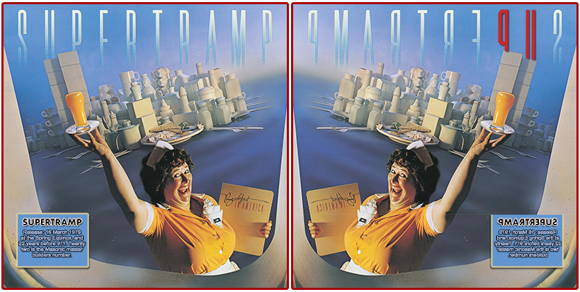
I will not break everything down here because so many have done it. I first mentioned this rabbit-hole-generating occurrence over 15 years ago, maybe more. Here are a couple that demonstrate the revelation-of-method album artwork for BIA. The artwork waitress is named “Libby” in the image giving a clear nod to the Statue of Liberty. She is holding a glass of OJ directly over the twin towers, instead of the illuminating torch. The color “orange” reduces using simple reduction to 33. The Statue of Liberty has been deftly shown to relate to the 1848 statue of Lucifer, complete with ankle chain and apple (note big apple idea for NYC). The crowns on both statues hold 7 points – etc., many have covered this for a long time now. There is much more, but I leave that to you. As is usual, it is all in plain sight and designed to be plausibly deniable. You tell me, was the Bible correct in identifying the prince of this world?
In the interest of time, I will simply present the coup de grâce artwork which hits the bullseye. There is far too much more to cover here. Looking at the album artwork in a mirror to reverse the image, a favorite occult method, the name of the band is very clearly shown to display the number 911 over the twin towers, looking out of an airborne plane, at the correct time of day, via the album title (breakfast), to encode the act of 911.
Moving on from ole’ Libby, her deceiving glass of OJ, and job title that sneakily informs us to wait 22 years (wait-ress), let’s look at Columbia, and her magically moving torch of illumination.
Much has been written about “Columbia” and all that she symbolizes. This includes her personification of America, and the implied “Christopher Columbus” association. These mainstream views have one founding America, and the other representing the symbolic goddess of our country. Not to mention the district surrounding the governmental seat-of-power. There is way too much occult information to cover here, but I will suffice it to say that Columbia, and all she symbolizes is a textbook example of an “egregore”. The show “American Gods” illustrates Columbia via personification, worship addiction, and much more.
Many solar cycles ago I became aware that Columbia Pictures production logo (goddess Columbia with torch), is a device symbolizing a litany of occult information and ideas. What is more, I noticed her torch would not stay put, constantly drifting. As a designer it made no sense as one would expect the torch to center in the image, or on a letter, or next to a letter for legibility. I took a closer look, because everyone knows when you see a Greek or Roman goddess old, stories, myths, and information abound. To illustrate that such devices convey meaning (hidden and otherwise), I will show you one aspect of the Columbia Pictures production logo over time starting in 1924 – at the spring equinox (3-15-24), of course.
Here is an early logo version from 1924 where we see the icon described as wearing a Roman soldier’s regalia. I guess someone likes military dress.
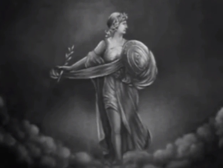
Evolving in the spring of 1936, the torch is now under the letter “U” which will become a theme for those who know. Consider the 911 work of Michael Hoffman with regard to 21 (black-jack = 21). The letter “U” also becomes 3 using simple reduction. Keep that in mind for later.
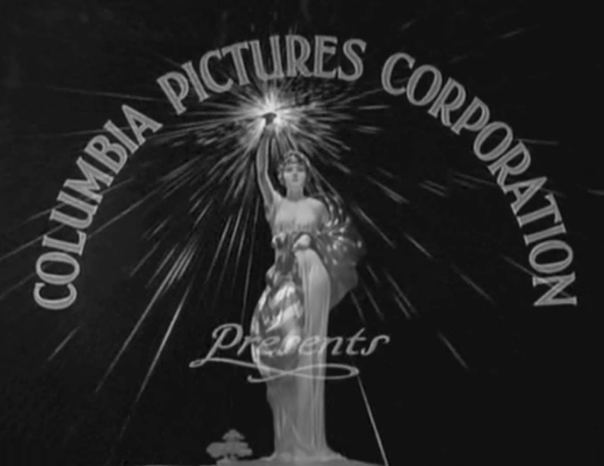
Around the same time Columbia begins to take the shape we are used to. Now it is time to keep an eye on the torch over time.
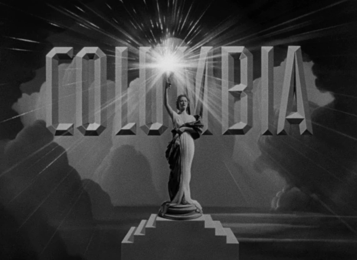
Here is one more pre 911 example of Columbia and her moving torch.
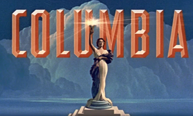
As we approached 911 the torch moved ever to the left. At the fateful new millennium her torch of illumination landed dead-center on the letter “U” making the two upright sides of the letter the occult pillars so much talked about. The adjacent letter “L” (L = 21, or reduced = 3) also provides for the much used “33”. Bearing in mind “U” can reduce to “3”, but holds the unreduced value “21”, again recalling Hoffman’s brilliant work.
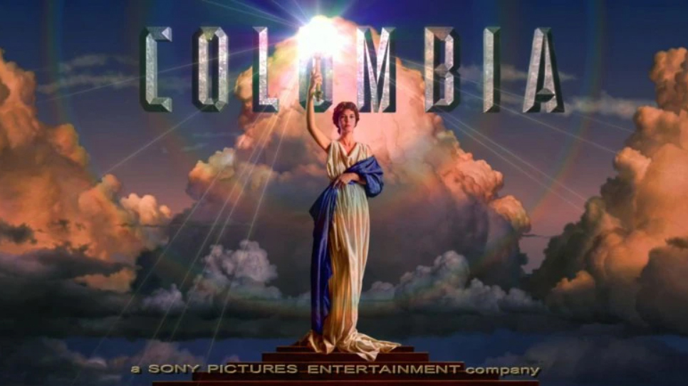
Torch hits dead center.
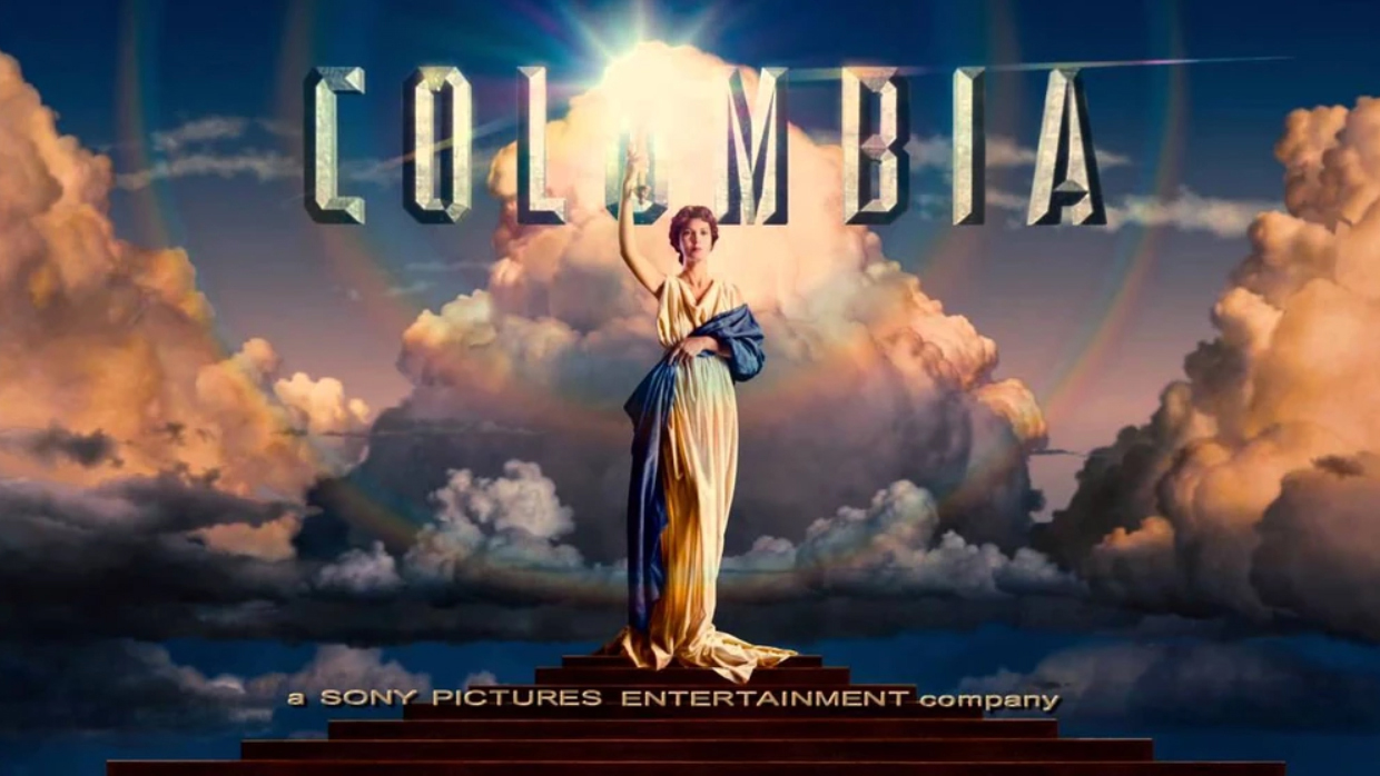
And finally, here is the current production logo just having had the 100 years celebration. But – notice that the torch now seems to be headed back to the right having hit dead center at 911/new millennium.
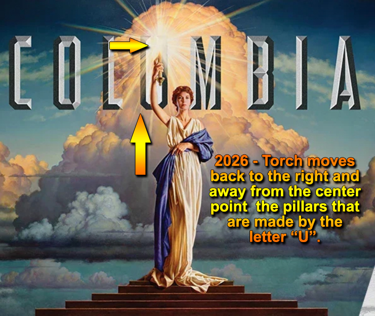
There is much more that could be pointed out in the use of such devices and branding tools. To make the point, an early logo named the type of cloud behind the once battle-garbed heroin now called Columbia. The cloud is a Cumulonimbus, according to the design information. Cumulonimbus clouds often symbolize power, intensity, and transformation in visual branding, reflecting their association with thunderstorms and severe weather.
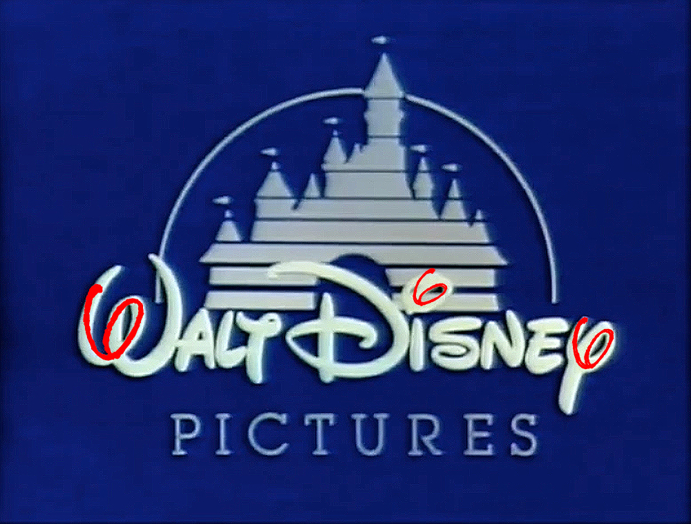
The main point here is to demonstrate many of the things we think are normal, and simply here to entertain, often have much more going on to include information presented for all to see, and few to comprehend. The examples are nearly universal in this era of corporate domination, and logos are in fact devices, in the same way any geometry has an energy. And in the final example: I thought the “6 flags” idea was for “Magic Mountain”. I see 6 flags over Disney, along with the cleaver handwriting. Or maybe we should just call it “cursive” in this case.
I await the new era when design energies are again applied with positive and beneficial intent. I would like to wish you all a happy, healthy, and higher-minded new era.
Comments (1)
Jason Lindgren Playlist For Members
Jason Playlist – Free Shows – Good for sharing